Unlocking Visual Fidelity: The Definitive Guide to Monitor Color Settings
Fast answer first. Then use the tabs or video for more detail.
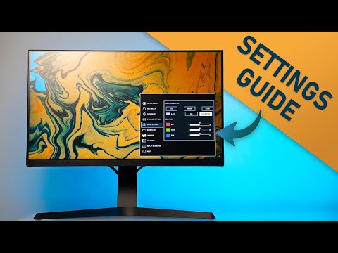
- Watch the video explanation below for a faster overview.
- Game mechanics may change with updates or patches.
- Use this block to get the short answer without scrolling the whole page.
- Read the FAQ section if the article has one.
- Use the table of contents to jump straight to the detailed section you need.
- Watch the video first, then skim the article for specifics.
The “best” color setting for any monitor is not a one-size-fits-all answer. It’s a context-dependent choice driven by your intended use case, the ambient lighting conditions, and even your personal preferences. However, a good starting point involves understanding color temperature, brightness, contrast, and color gamut, and how these elements interplay to create the optimal visual experience for you. Calibrating your monitor using a colorimeter for professional work will give you the most accurate results.
Diving Deeper into Monitor Color Settings
To truly master your monitor’s color settings, you need to grasp the core concepts that govern image quality. Let’s break down these essential parameters:
1. Color Temperature: Setting the Mood
Color temperature, measured in Kelvin (K), dictates the “warmth” or “coolness” of the white light emitted by your monitor. Lower Kelvin values (e.g., 5000K) produce a warmer, yellowish tone, while higher values (e.g., 9000K) result in a cooler, bluish tone.
- 6500K (D65): This is the industry standard for general use, and particularly well-suited for video content and gaming. It’s considered a neutral white point and provides a balanced color representation. Many monitors default to this setting.
- 5000K (D50): This is the preferred setting for graphic design and print work. It simulates the color temperature of standard printing paper under daylight conditions, ensuring that what you see on your screen closely matches the final printed output.
- 9300K: Some monitors offer this setting, but it often results in a very cool, bluish image that can be fatiguing for the eyes over extended periods. It is generally not recommended for most applications.
- Custom/User: Most monitors allow you to manually adjust the red, green, and blue (RGB) color channels, giving you precise control over color temperature. This is ideal for fine-tuning the display to match your specific needs and preferences.
2. Brightness and Contrast: Illuminating the Details
Brightness controls the overall luminance of the screen, while contrast determines the difference between the brightest and darkest parts of the image. Finding the right balance between these two is crucial for achieving a comfortable and visually appealing image.
- Brightness: Start by setting the brightness to a comfortable level that doesn’t strain your eyes. A good rule of thumb is to match the brightness of your monitor to the ambient light in your room. If you’re working in a dimly lit environment, lower the brightness to avoid eye fatigue. In a brightly lit room, you may need to increase the brightness to see the screen clearly. A brightness between 40% and 60% is ideal for most settings.
- Contrast: The contrast setting should be high enough to clearly distinguish between different shades and colors, but not so high that it causes the image to appear washed out or overly dark. A good starting point is around 70-80%, but experiment to find what looks best to your eyes.
3. Color Gamut: The Spectrum of Possibilities
Color gamut refers to the range of colors that a monitor can reproduce. Common color gamuts include sRGB, Adobe RGB, and DCI-P3.
- sRGB: This is the standard color gamut for most web content, games, and consumer applications. A monitor with 100% sRGB coverage will accurately reproduce the colors intended for these applications.
- Adobe RGB: This wider color gamut is often preferred by photographers and graphic designers because it can reproduce a broader range of colors than sRGB, particularly in the green and cyan regions.
- DCI-P3: This even wider color gamut is becoming increasingly popular for HDR (High Dynamic Range) content and cinema. It offers a richer and more vibrant color palette than sRGB.
For most users, 100% sRGB coverage is sufficient. However, if you’re working with professional photography, video editing, or graphic design, a monitor with Adobe RGB or DCI-P3 coverage may be beneficial.
4. Gamma: Fine-Tuning the Tones
Gamma refers to the relationship between the input signal and the output luminance of the monitor. Adjusting the gamma setting can affect the overall brightness and contrast of the image, as well as the visibility of details in dark or bright areas. A gamma of 2.2 is generally considered the standard for PCs and provides a balanced image.
5. Other Monitor Settings
It is important to consider other settings on your monitor to achieve the best results.
- Response Time: Setting your response time is beneficial for gaming. It affects the amount of ghosting you see in high action scenes.
- Black Stabilization: Setting a good black stabilization allows you to see better in dark areas. This is often used in competitive gaming so players can better see their opponents in dark areas.
The Application-Specific Approach
As mentioned earlier, the ideal color settings depend heavily on the application. Here’s a breakdown of recommended settings for common use cases:
-
Gaming:
- Color Temperature: 6500K (D65)
- Brightness: Adjust to comfortable level based on ambient light
- Contrast: Adjust to a level where details aren’t lost in bright or dark areas
- Color Gamut: sRGB (100% coverage is ideal)
- Response Time: Set the response time to the lowest setting that does not cause ghosting.
- Black Stabilization: Adjust the black stabilization setting to a level where you can see details in dark scenes.
-
Graphic Design/Photography:
- Color Temperature: 5000K (D50) for print work, 6500K (D65) for web work
- Brightness: Adjust to a comfortable level
- Contrast: Adjust to a level where details aren’t lost
- Color Gamut: Adobe RGB or DCI-P3 (for wider color range)
-
Video Editing:
- Color Temperature: 6500K (D65)
- Brightness: Adjust to a comfortable level
- Contrast: Adjust to a level where details aren’t lost
- Color Gamut: DCI-P3 (for HDR content) or sRGB (for standard content)
-
General Use (Web Browsing, Office Work):
- Color Temperature: 6500K (D65)
- Brightness: Adjust to a comfortable level
- Contrast: Adjust to a level where details aren’t lost
- Color Gamut: sRGB
Frequently Asked Questions (FAQs)
1. Should I use sRGB for gaming?
Yes, sRGB is generally fine for gaming because most games are designed with the sRGB color space in mind. While a wider color gamut like DCI-P3 can offer more vibrant colors, it’s not essential for a good gaming experience.
2. What is the best color setting for a gaming PC?
Set your monitor’s color temperature to 6500K and adjust brightness and contrast to comfortable levels. Ensure your color profile is set to sRGB in the display settings.
3. Which color tone is best for gaming?
Many gamers enjoy using RGB colored lights to create a cool ambiance that enhances immersion. Cool colors like blue, green, and purple are often used to generate this vibe.
4. What color monitor setting is best for eyes?
Dark mode can be helpful in dimly lit environments, but in bright rooms, a white background with black text may be more comfortable. Experiment to see what works best for you.
5. Is 99% sRGB good for gaming?
Yes, 99% sRGB coverage is excellent for gaming. It ensures that the colors in the game are accurately reproduced as intended by the developers.
6. Is 100% sRGB good enough?
Yes, 100% sRGB coverage is great for most users. It’s sufficient for general use, gaming, and even some professional applications.
7. Is 100% contrast good?
Setting the contrast to 100% isn’t recommended. It can lead to blown-out highlights and a loss of detail in bright areas.
8. How do I optimize my monitor settings?
Start by going to your display settings, setting the correct gamma values, adjusting brightness and contrast, and fine-tuning color levels.
9. How bright should a monitor be for gaming?
A real scene peak brightness of over 550 cd/m² is considered good enough for gaming in HDR.
10. What is the most accurate color gamut?
sRGB has a firm position as the standard in Windows environments, and many devices are configured to reproduce it accurately.
11. What is the ideal sRGB?
Ideally, aim for 90-100% sRGB coverage, especially if you’re a content creator where color accuracy is important.
12. How can I check my screen’s sRGB coverage?
You can usually find this information in the monitor’s specifications or by using a colorimeter to measure the color gamut.
13. What is the best color temperature for a monitor?
A color temperature of 6500 K is standard for ordinary PC use and for the sRGB standard.
14. What is the best brightness for a monitor?
The best monitor brightness is typically between 40% and 60%, depending on your ambient lighting and activities.
15. Is sRGB enough for HDR?
Most HDR images will still look good with a limited sRGB gamut, but for the best HDR experience, a monitor with DCI-P3 coverage is recommended.
Final Thoughts
Finding the perfect color settings for your monitor is an ongoing process of experimentation and adjustment. By understanding the fundamental concepts and considering your specific needs, you can unlock the full potential of your display and enjoy a more immersive and visually pleasing experience. Dive deeper into the world of learning with games at the Games Learning Society website, GamesLearningSociety.org.